

February 21, 2022
MY 2022 WEBSITE DESIGN TREND FORECAST
As a brand and web designer for creatives, it’s important for me to have my finger relatively close to the pulse when it comes to website design trends.
Being true creatives themselves, my clients are no stranger to pushing the boundaries of their industries. Often leaders in their fields, their aim is to push ahead of the ‘competition’ and be trendsetters – rather than followers.
While trend following isn’t ideal for every brand, my job is to study trends to make sure my client’s brands and websites stand out and attract the type of ideal clients they are looking for.
So, after having some time to rest, reflect, and soak up the blur that 2021 was, I took some time to have a good look at what was going on in the design world. The verdict: It was fun… and weird …and shocking.
While I can’t 100% predict the future, I thought it would be helpful to report on what I personally think is going to be popular in 2022. So I compiled a list of my top 10 predictions for 2022 Brand and Website Trends. From gimmicky 80’s-style video games, to scrapping all the rules entirely with Anti-design, this year is going to be… unique.
My top 10 Website and Graphic Design Trend Predictions for 2022
- Textured Gradients
- Art Deco-Inspired Typography
- Y2K
- Experimental Typography
- Bold Text Hero Sections
- Monochromatic and Duotone Designs
- 90’s Website Experiences
- Archi-text
- Anti Design
- Layering and Collage
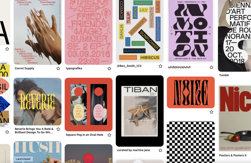
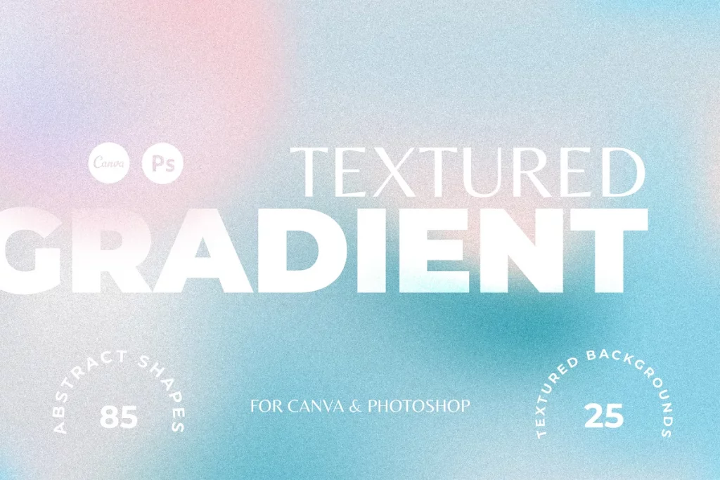
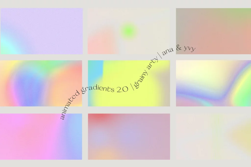
1. Textured Gradients
The first design trend is not much of a surprise to many people; textured gradients had a huge rise in 2021 and in 2022, I think it’s far from being over. This year, I think we are going to see more texture and structure when it comes to our gradients. Rather than straight lines and grain, I predict in 2022 I think we will see the rise of the radial gradient.
While linear gradients are usually a straight line gradient from one color to another, radial gradients radiate out from a central point. They can often have multiple colors, be asymmetrical, and are often a little more on the quirky side.
My current favorite is an iridescent gradient – it’s super subtle, but brings back those nostalgic 00’s vibes!


Create the Look Yourself:
If you have access to graphics editing software such as Adobe Photoshop or Illustrator, play around with different forms by adding additional color points. Otherwise, Creative Market is a fantastic place for sourcing gradients. Here are some of my favorites!


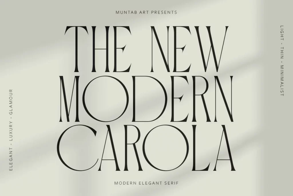
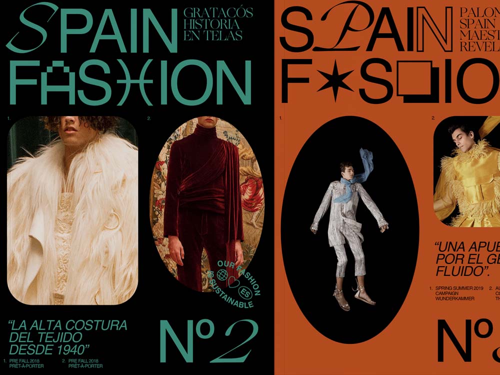
2. Art Deco Inspired Typography
Art Deco is back, folks, and I’m personally loving it.
Around mid-2021 we started to see art deco-inspired typography start to pop up more and more as people started to jump on the trend.
“Vibrant colors, broken aesthetics, psychedelic design, and wild movement by using clean, powerful lines as an organizing design element”
Source: Trends Design Hugger
While this design trend is definitely inspired by the art deco design era, I think it’s going to be very unique this year. Paired with Y2K and Anti-design movements we discuss later in this article, we can expect this trend to become an entirely new beast. I’ve been loving some of the modern takes on art deco fonts I’ve been seeing lately and have been excited to start incorporating a few subtle elements into client websites and branding.


Create the Look Yourself:
Some of my favorite free fonts I’ve been using lately include Futura and Josefin Sans. They are classic, yet subtle san-serif fonts that pair really well with others.
Along with those, Creative Market has a great selection. Here are some I found recently that I loved the look of!


3. Y2K
In case you didn’t know, (like me until I went to write this blog post), Y2K is the shorthand term for “the year 2000.”
In addition to that, I’m really embarrassed to show my (young) age when I say that this is the only trend on the list that I was actually alive for the first time around. 🙃😅
I’m sure you’ve seen the Y2K trend circling around fashion circles already and we’re seen graphic design start to follow suit and pick up traction. Think grunge, distortion, holographs, and nostalgia. Lots of vintage skate and surf brand logos and quirky, mismatched design elements.


Create the Look Yourself:
“Oversimplified interfaces, low poly CGI, neon colors, and holographic textures borrowed from CDs. Now, as these retro attributes sound like a distant memory, designers have their eyes on the visual of Y2K. Y2K throws us back from polished minimalism and clean design to a funky merge of pop, Kawai, neon, and tech.”
Source: The Designest
My advice is to try to go easy on this trend. A full-on Y2K adaption might look a little tacky, and it will date faster than you can say “I need to feed my Tamagotchi”. Ew, terrible joke, I know. Ignore I said that.


4. Experimental Typography
In number four, leading on from the previous two trends; I think experimental typography is going to be another big trend this year. It focuses on fonts with decorative features, shapes, and traits. I think the trend will be especially powerful when combining typeface styles such as Art Deco, ’90s retro, and Y2K styled fonts.
“Experimental typefaces are generally of the display family, and have an unexpected look or interaction, such as animation, different x-heights, or a general disregard of the rules of letterform shape and spacing. These text styles include quirky lines, colors, and letterforms.”
Source: Carrie Cousins


Create the Look Yourself:
Be a little more playful when it comes to typography. Keep an eye out for fonts that complement your primary ones and can be used as an accent for hero pieces and marketing materials. These fonts work best as display pieces, so try to avoid using them for body text or long headings.
If you really want to lean into the Anti-Design trend, you can take it further by combining letters from different fonts, playing with italics, bolding letters, or even potentially flipping or distorting them.
The possibilities are limitless with this trend, which makes it very fun to play around with!


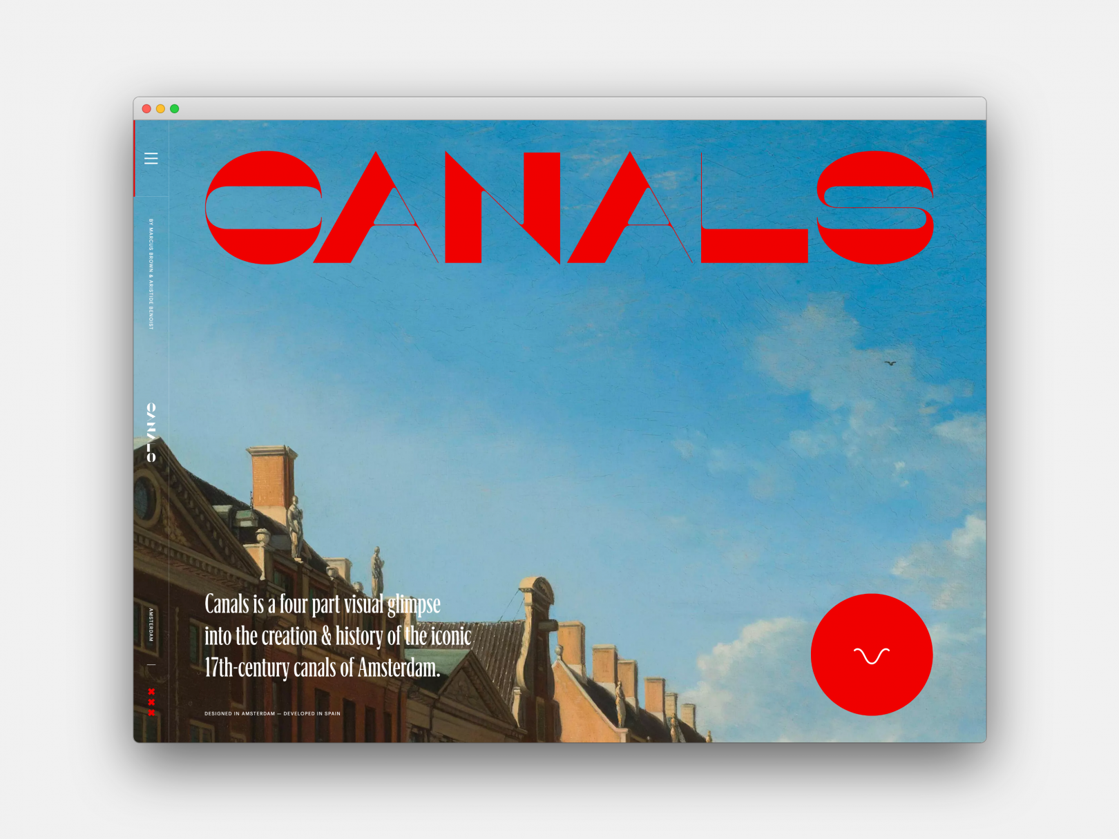
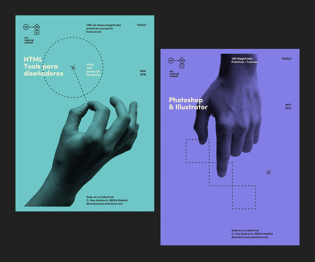
5. Bold Text Hero Sections
Inspired by Anti Design and Brutalism design trends that are making a comeback, I think a focus on typography and copy is going to have a big presence in 2022. One way I can see this making its way into the web design world is through large and bold text hero sections.
A “Hero section” of a website is simply to part of the website you can see before you begin scrolling. In the past, newspapers would always put their most eye-catching, important information “above the fold” to increase sales.
People judge your brand within the first 3 seconds of landing on your website, so it’s important to hook them straight off the bat. And while photos can make for entertaining visual interest, your text is what is really going to captivate in your audience and get them to begin scrolling through your site.
“It doesn’t just matter what the text says, what’s also important is how it says what it says — how it’s presented and designed. When done right, typography powers the hero copy, makes the message more compelling and allows it to linger in the visitor’s mind for longer.”
Source: Medium.muz


Create the Look Yourself:
Put an emphasis on the copywriting on your website, or better yet, hire an expert to help you with it. Copywriting is such a valuable investment for your website and a good copywriter can help you establish a good hero text statement that is going to capture the attention of your audience.
No font recommendations here, as this is going to be completely unique for your brand. A strong, statement font that encaptures your brand essence is what you are looking for here.
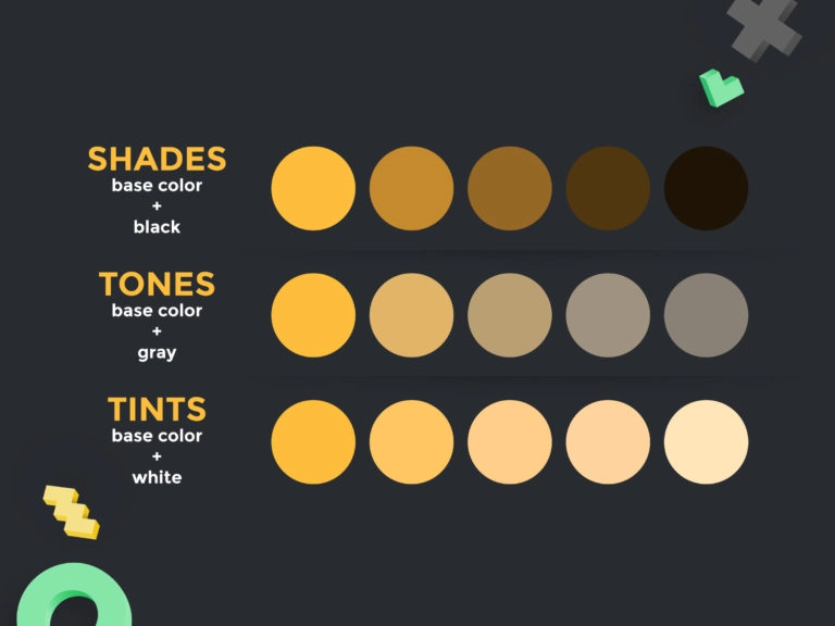
6. Monochromatic and Duo Tone Design
Monochrome and duotone palettes focus on a singular or two basic hues, rendered in various tints, tones, and shades. And while many people associate monotone with black and white, it can actually consist of any color and shades of it.
“Duotone effects came into existence with the use of cameras. It first appeared with the use of sepia photographs. Sepia photographs were created using the different shades of brown colors partially to preserve and warm-up the undecorated appearance of the humans in the grayscale industrial era.”
Source: Web Design Dev


Create the Look Yourself:
The graphic below shows some different color principles that you can use to create a monochrome look. You can create a monochrome look by either creating shades, tones, or tints of your base color. The same goes for duotone, only you would just add your secondary base color.
Play around with recoloring photos, cutouts and graphics in mono or duotone. They work especially well when working with collages and help mute backgrounds so the type and content can be more of a focus.
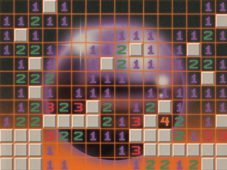
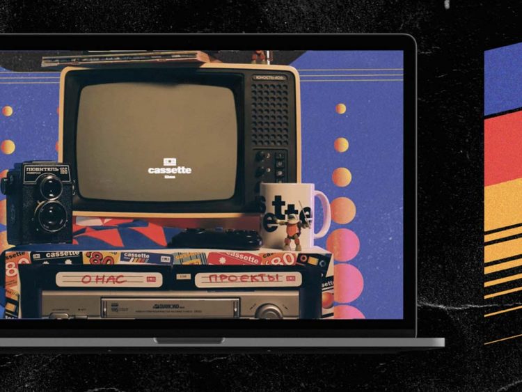
7. 90’s Website Experiences
Who would have thought people would now be paying to make their website look pixelated and chaotic. Totally joking, this trend is a fun one and leans very much into the ’90s + 00’s Y2k trends. Think grainy gradients, pixelated graphics, and a neon-loving video game aesthetic.
Need some inspo?
The Website Design Museum has some screenshots of actual big brand websites in the 90’s – from Adobe to a biography website about Antonio Banderas. It’s a good laugh, and might serve as some inspiration for those of you looking to go ‘all in’ on this design trend.
Head to the Web Design Museum to check it out


Create the Look Yourself:
Look out for graphics with vivid and fluorescent color palettes, synthwave patterns, blurred edges (to give a neon effect), and retro, digital-inspired fonts. If you really want to invest in this trend, finding a developer who can help you gamify parts of your website to make it interactive is a fun way to pay homage to this trend without going way over the top.


8. “Archi-text”
In number 5, we talked about Bold Text Hero Sections and how many are looking away from hero images and more towards typography, and how it can tell a story.
This trend takes it a step further with what I like to call “Archi-text”. I don’t think this is an official term so designers; if you know what it is called, please let me know!
“Archi-text”, to me, refers to creating structure and shapes using just typography and text wrapping methods to create drama and often tell a story. It can be an incredibly powerful way to capture people’s attention and brings an element of fun and personality to your designs.


Create the Look Yourself:
Design programs such as Adobe Illustrator or Indesign are going to give you the most freedom with this design trend, however, if you are really wanting to give it a go, there’s a lot you can do on programs such as Canva with a little bit of manual work. Start off by creating one-dimensional shapes or spacing text out on your website into bite-sized, readable chunks.
9. Anti-Design
Anti-design is an expression of rebellion – bending, stretching, and re-interpreting the rules of graphic design.
“Originating in Italy and lasting from the years 1966 – 1980, the movement emphasized striking colors, scale distortion (ie. giant chairs that make you look small), and used irony and kitsch. The function of the object was to subvert the way you thought about the object. In architecture, this was also known as the Radical Design period.”
Source: Art History Archive
Anti Design VS Brutalism
Similar to the Brutalism design trend, which is all about rawness and looking ‘unadorned’. Anti-design differs in that it makes a point of ugliness, often using clashing colors, no discernable visual hierarchy and skewed, hard-to-read text.
“It’s more of a punk mindset whereas brutalism tends to have its roots in efficiency and functionality.”
Source: Kate Moran


Create the Look Yourself:
Anti Design, although looks chaotic, may be a harder trend to pull off if you are not experienced in graphic design.
“While it’s important to understand the basic rules of design, the best designers know that sometimes the key to creating something innovative and unique is to bend or break them.”
Source: Imagine Express
My biggest tip for someone wanting to delve into Anti-Design is to first learn the key principles of graphic design.
Learn the rules, so you can break them.
Once you have these key principles under your belt, you can start to play with things such as mixing up fonts, distortion, adding movement, and unexpected elements. Less is more here, start off small and work your way up to more complex compositions in your designs.
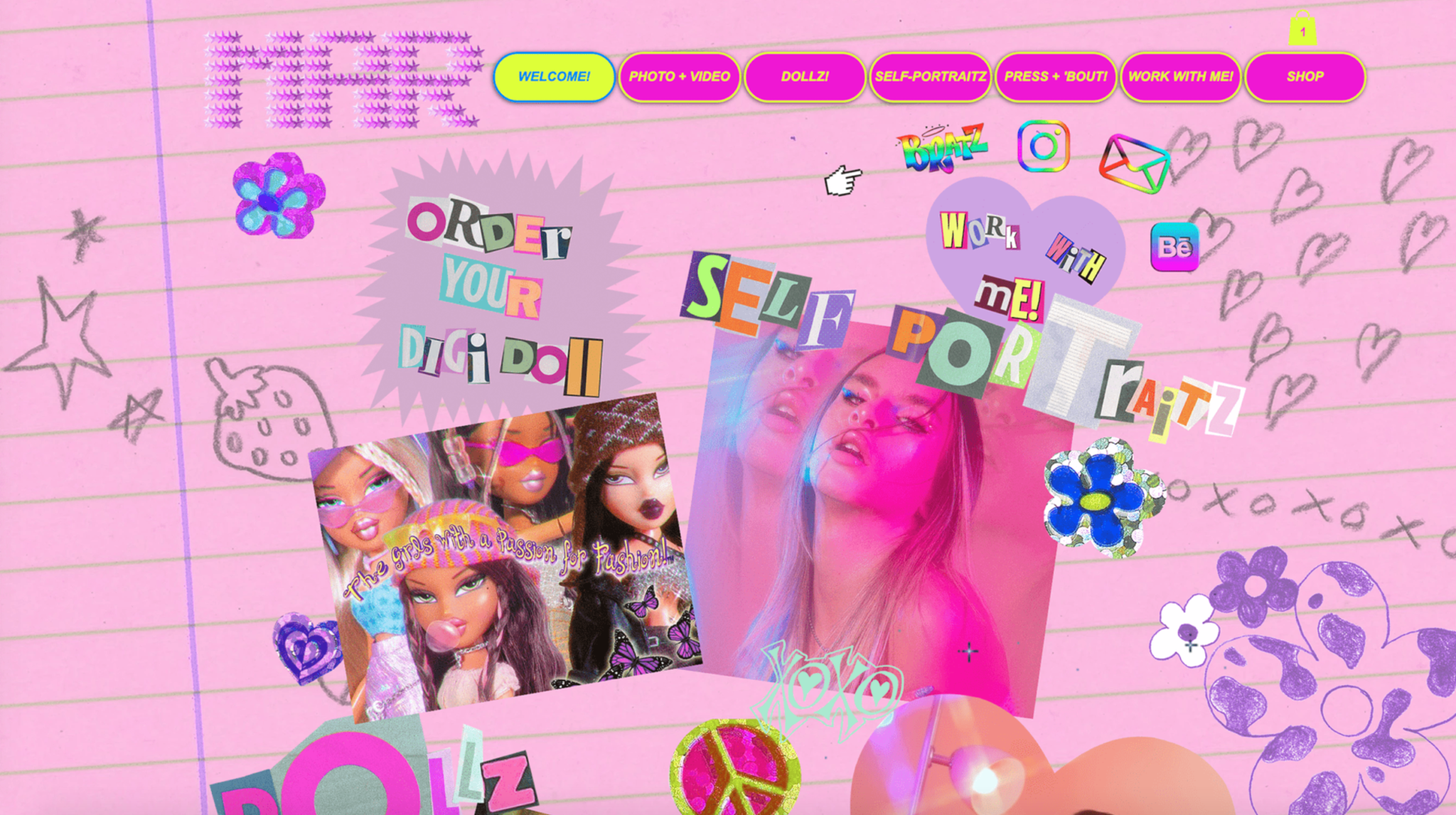
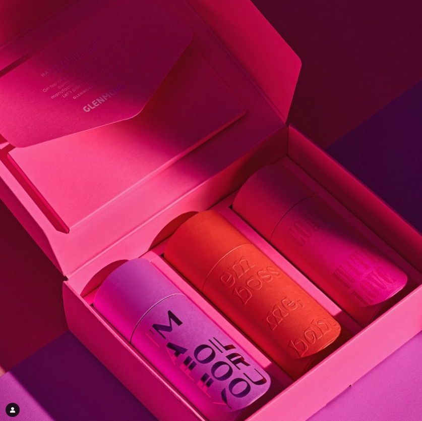
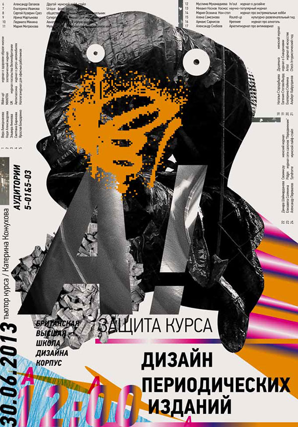
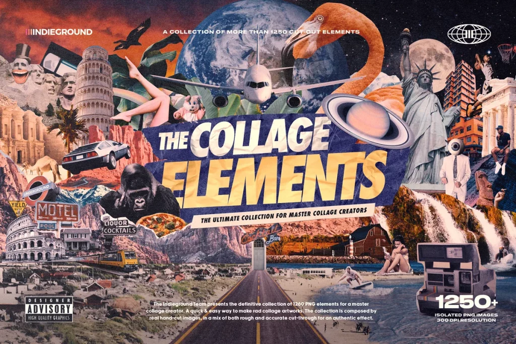
10. Layering and Collage
Finally, my last trend prediction is the use of layering and collage in design. This is one of my favorite trends for 2022 because it’s so easy for most people to play around with! Layering photo cutouts and text is a great way to introduce depth and interest to a design and make it look much more attention-grabbing which makes it ideal to use in hero and other important sections on your website or branding.
I love combining this trend with others such as the anti-design and Monochromatic trends to create something completely absurd and fun.


Create the Look Yourself:
Use online background remover tools to create cutouts of your brand of product photos to display on your website. You can use these cutouts layered against text (think like a magazine cover) for a powerful hero section of your site.
Alternatively, you can shop at places like Creative Market for collage packs that suit your brand and use design software tools such as Canva to create fun compositions for graphics or your website.


Conclusion: The thing about trends is, they’re trends.
With any design trend, it’s important to remember that, it is a trend.
Design goes in and out of fashion in waves. Some things come in and stay for some time, while some things burn out quickly.
While we all love a trend, it’s important foremost that you first have an understanding of your brand. What works for some people might not work for you.
Figuring out what makes your brand, who your target customers are, who your competitors are, and what set you apart is going to be the biggest way for you to figure out whether or not a particular trend is going to be worth your time.
Nailing down your brand strategy is the best way to help you figure out what trends are worthwhile and what is worth skipping.
Whether you decide to fully embrace trends or skirt around them, I think it’s important to be aware of why trends are happening. The more aware you are of what’s going on around you in the design world, the better you will be able to design your own things that look amazing for your brand – which is my biggest goal for all of you!
What 2022 Website Design Trends will you try?
What do you think about my top 2022 Website Design Trends? I’d love to hear which ones you are going to give a try in 2022!


I'm Madison; a thrift-loving, surf searching Brand + Web Designer based on the Gold Coast, Australia.
Categories
Categories
MARKETING
SEO
BUSINESS
TUTORIALS
DESIGN
WEBSITES
I help small business owners, photographers and downright-cool-people build strategic online spaces that help them achieve FREEDOM.