Lainey Coleman: Elopement Photographer Website and Branding
July 1, 2020
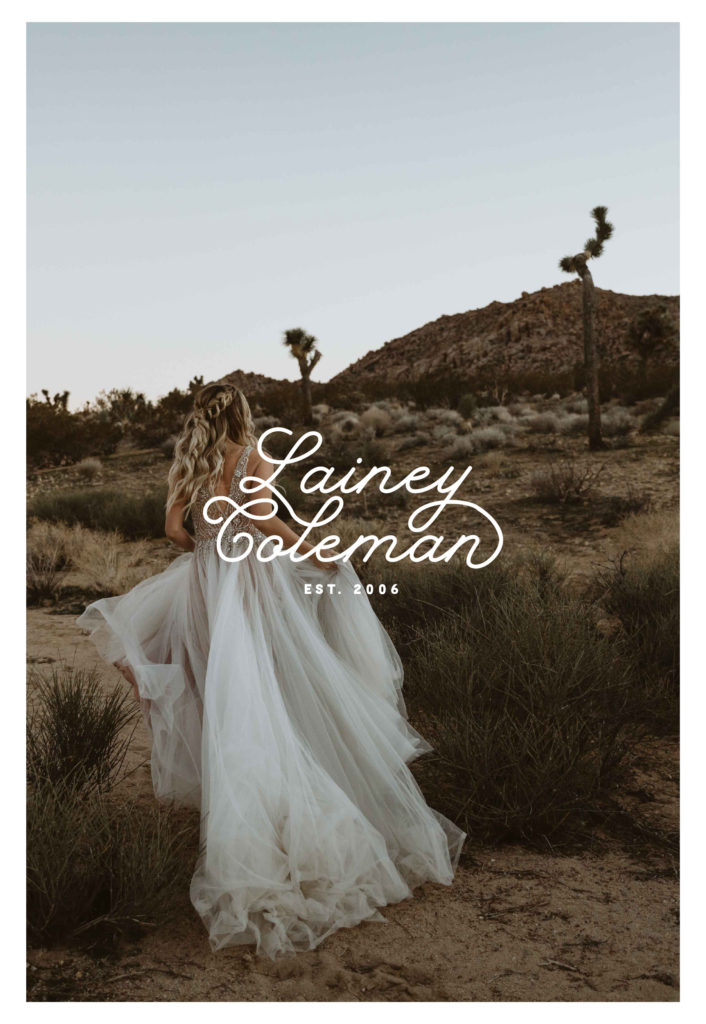
While so many photographers love to DIY their own websites, I wanted to create this month’s Fake Client Project around and adventurous elopement photographer to highlight the strategic ways a website designer can elevate your brand.
The branding brief
‘Lainey Coleman’ is an adventurous elopement photographer based in New Zealand. I wanted to draw on inspiration from travel; vintage postcards, boarding passes and national park bumper stickers.
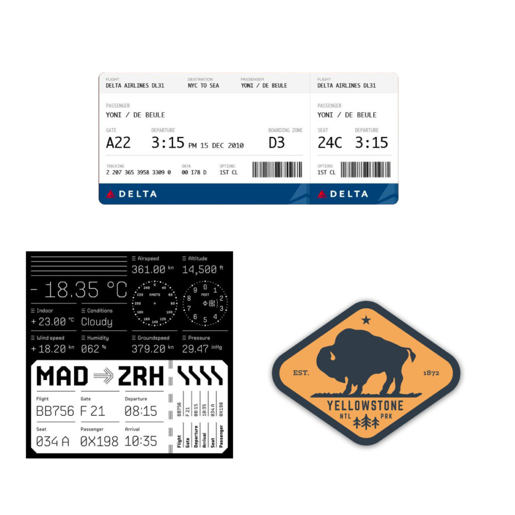
Elopement Mood Board
While I loved the look of the travel elements, so far, they felt very ‘masculine’ and bland. I wanted to add those beautiful adventurous layered elements that would make someone say “Yes! this is her!”
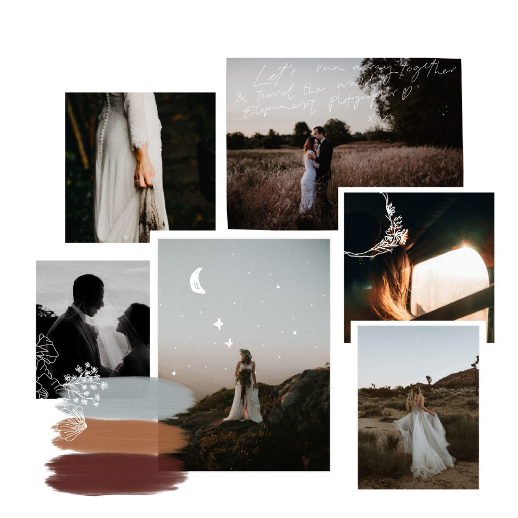
The final mood board looked something like this. It balanced the deep reds and oranges or travel making it feel grounded, strong and adventurous, while the silver-blue streak gave it that slight bit of elegance. I also added some illustrations to the mood board to balance it all out and make it more grounded and real.
Photographer Logo
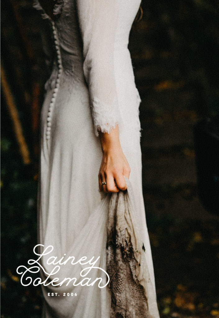
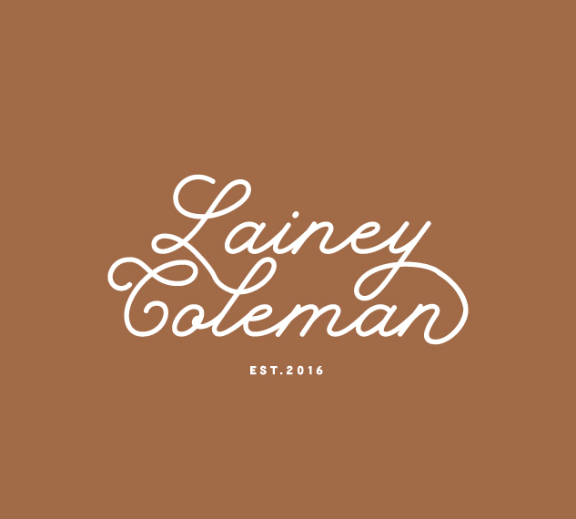
Main logo
If you want to watch the whole process of me creating this logo, I highly recommend you check out my June Instagram highlight!
I was originally working with a more ‘blocky’ style font – but I just was not happy with it or the way it was feeling. I wanted to introduce a new font – which you see here. While to me it still felt like ‘old travel style’, this particular font had that air of ‘femininity’ and elegance.
I decided to do some custom work with the outlines, connecting some of the ligatures to create this type logo.
Sub-marks / Alternative Logos
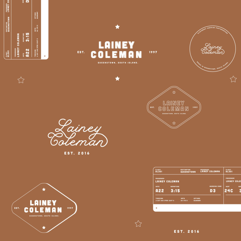
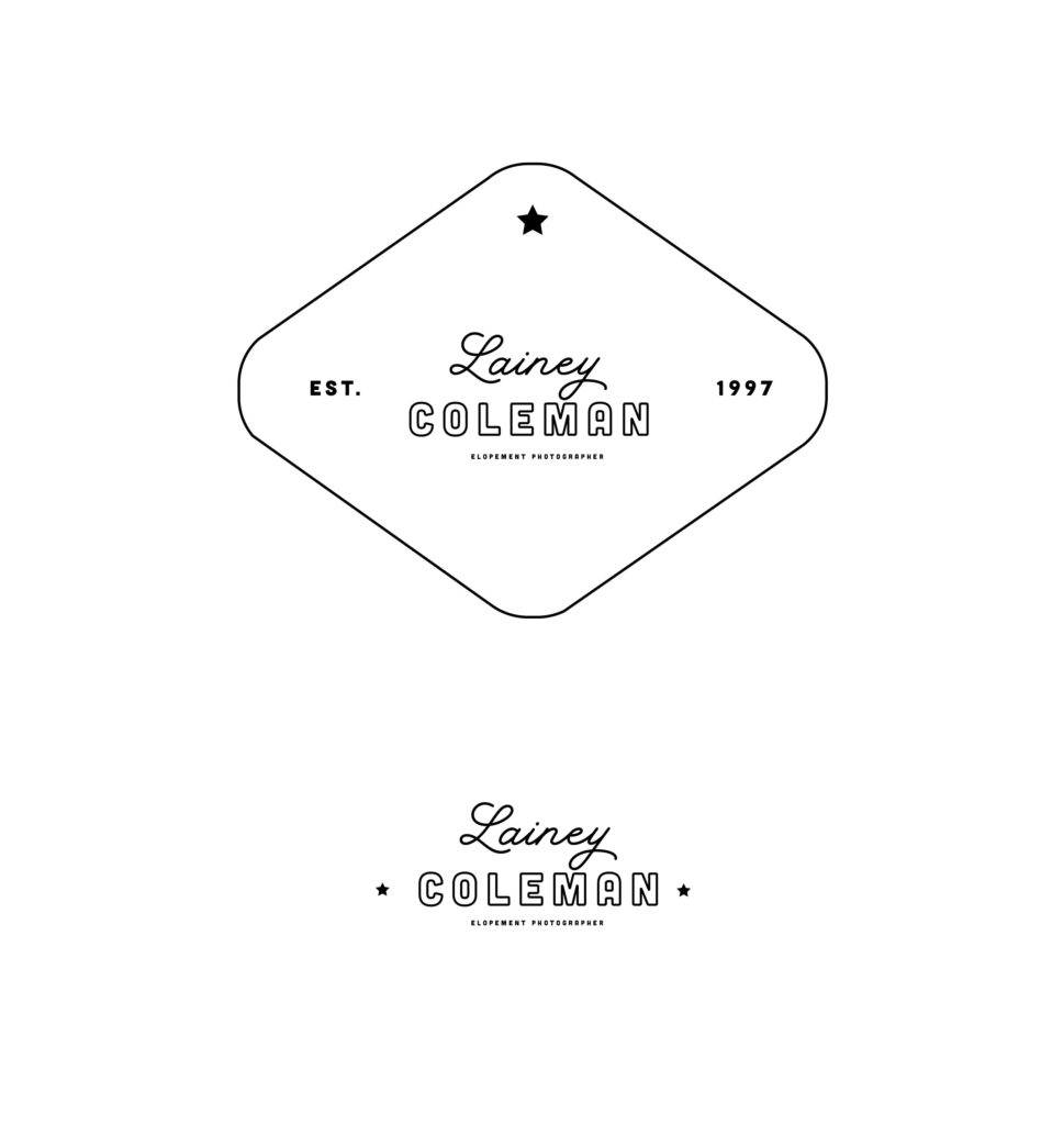
Underneath you can see some of the supporting and alternative logos I created with the original font and same script as the main logo.
Elopement Photographer Website Design
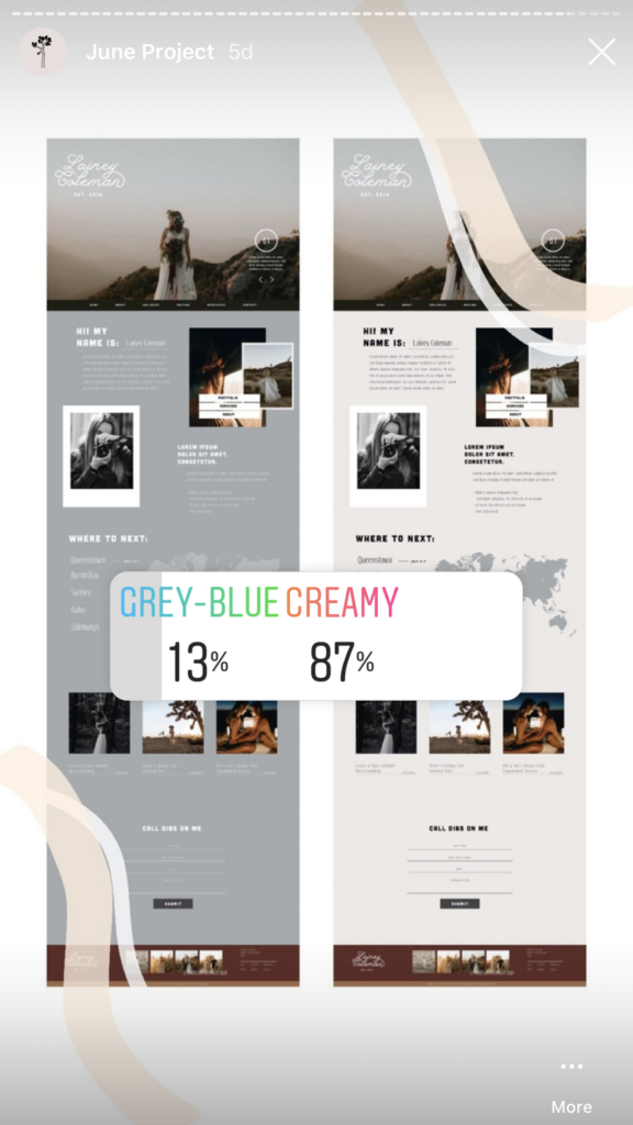
I created two versions and got feedback from my Instagram audience on which background colour they preferred. This light, creamy background was a clear winner!
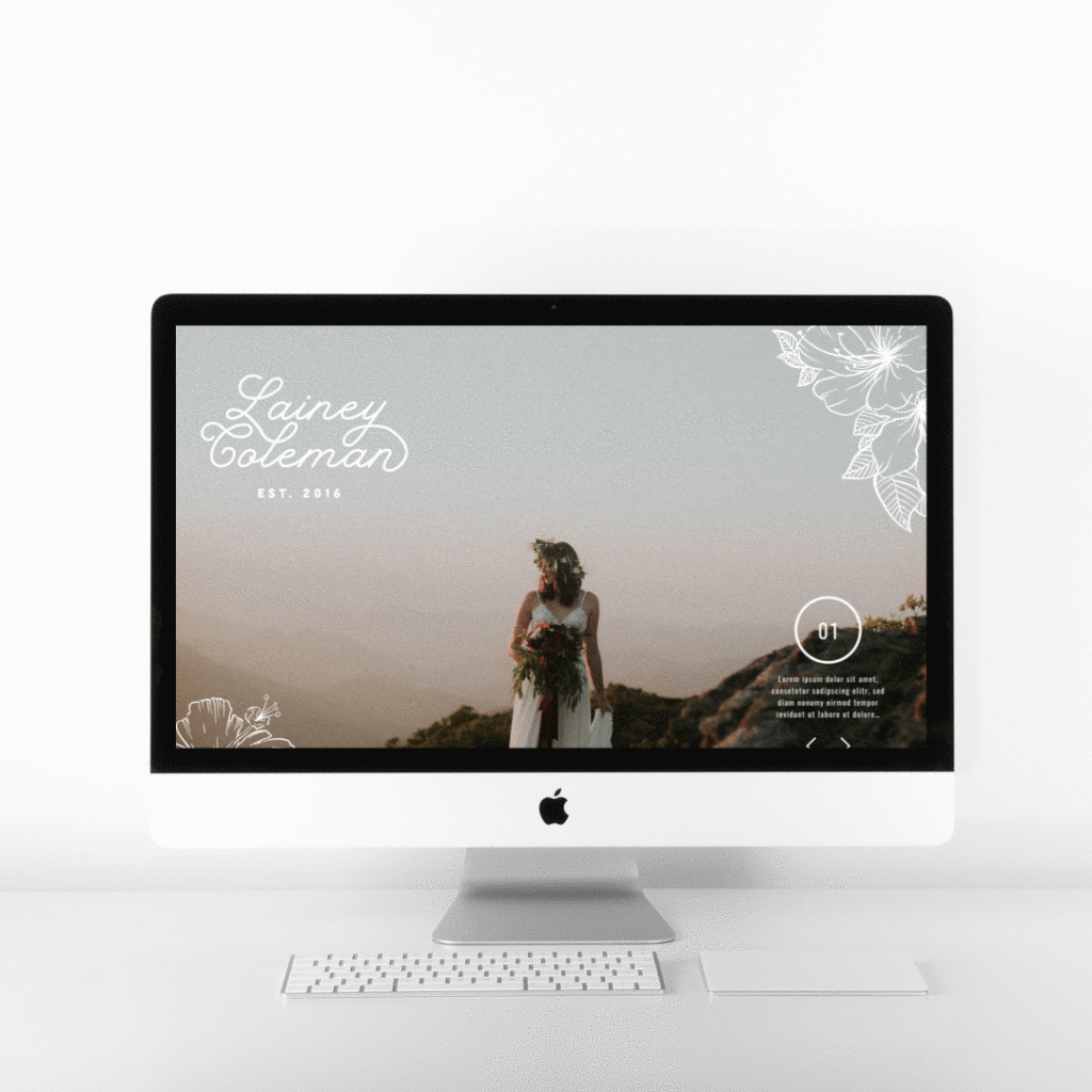
With photography website, I like to keep a large full-size hero image at the top of the website. Since photography is your work, it’s important to show it off. A slider feature was also added so that you could add up to 5 of your best photos in this space here.
I decided to put the main menu navigation underneath for this reason as well. I didn’t want to take up any more valuable space. On a real site, the menu would work well to be sticky upon scroll, so your website guests would never have to go searching for the menu when they wanted to browse through the site.
Map
I thought it would be fun to include a little map feature that lets website visitor see upcoming travel dates and use it to plan their own elopements – it’s just one of those little things that make a website and brand stand out.
Blog/ Gallery
This section could be used as either a blog or image gallery for Lainey. I trialled a few different versions of this, but in the end, keeping it simple and carrying on the horizontal line theme looked best.
Footer
The contact form was looking a little bit boring so I decided to add a fun little feature. I created a fun mountain valley scene that draws the viewers downs the centre and towards the Instagram reel.
Since most photographers are on Instagram, the graphics act as a way to funnel people down to the next step. This is a really fun way to cultivate relationship-buildingwith potential clients!
Florals
Lastly, I added the florals like in our initial mood board. I think it gave the whole design a little pizazz and took the design to the next level – which will help it stand out upon the competition!

Elopement Photographer Website Reveal
Could you see yourself with a website like this? Send an email to hello@ atlasstudio.co, or visit my services page to download my pricing guid.
I can’t wait to get started on your adventurous web design projects!
I'm Madison; a thrift-loving, surf searching Brand + Web Designer based on the Gold Coast, Australia.
Categories
Categories
MARKETING
SEO
BUSINESS
TUTORIALS
DESIGN
WEBSITES
I help small business owners, photographers and downright-cool-people build strategic online spaces that help them achieve FREEDOM.
