

July 12, 2020
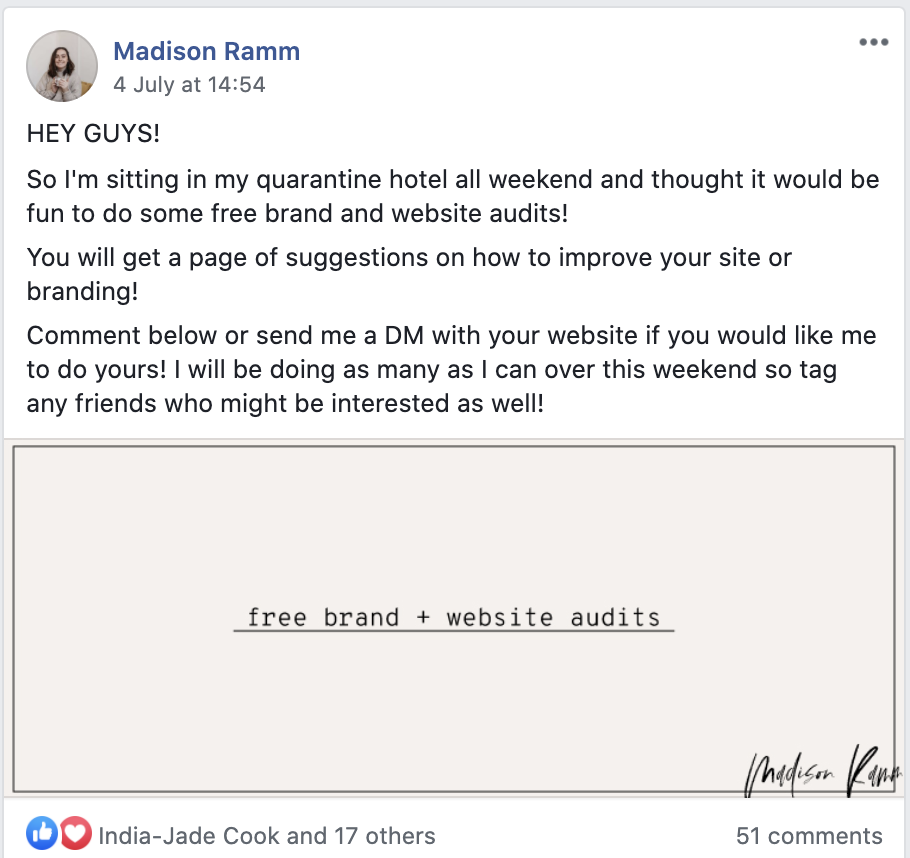
Last weekend I put an offer out in a few Facebook groups for free Website Audits. Over two days I completed over 30 website audits and noticed something… the websites I was auditing were making the same mistakes over and over. Seriously! At one point I had a note going in the background so I could copy and paste the same things in.
So while I am not planning on doing another round of website audits anytime soon, (they were soooo exhausting!), I decided to go live on my Instagram to talk about the 5 most common website mistakes I saw (and how you can fix them yourself!).
1. Lack of branding or consistency
The first big website mistake I saw was lack of branding. Branding can help you stand out from your competitors and make people like, trust and ultimately purchase from you! The key to effective branding is consistency – I want to see and feel your brand all throughout.
This isn’t just your logo; your colours, fonts, language, tone of voice and imagery all contribute to this! Your branding is part of your entire customer experience, so it’s important to make sure that every touchpoint with your potential customer is a positive experience that reflects on your brand! This is how people will remember you and tell their friends about you!
2. Not focusing on your copy.
The words on your website are just as important as the design itself!
Website copy is more important than most people give it credit for – in fact, the words on your website go hand in hand with a well-designed website. I put it down to 1/3 of the whole website experience:
Madi’s Recipe for a high converting website:
– 1/3 cup of good design taking target customer values and user experience into consideration
– 1/3 cup of great copy. Emphasize with users about their problems and tell them how you can solve them. Bonus points for infusing your personality or brand personality into it (see Tip #1).
– 1/3 Quality content that speaks to your target customers, eg. your products, offers and services
Contrary to what seems to be popular belief, your website is not actually about you and your achievements. Your website is about your target customer and how YOU can solve their problems.
If you are DIY’ing this part, I can’t recommend enough doing your research on your target customer. Not only will you find out more about their interests, but you can figure out their problems and even the kind of language they use so that you can get in their head and seem like you are reading their minds. You can download my target customer workbook from here.
DIY’ing this part?
Download my target customer workbook!
If you do have a little bit of budget for it though or aren’t a confident writer, I can honestly say that hiring a professional copywriter is a fantastic investment into your business. They can really help hone into your messaging and captivate your target audience. So if you are like me and sometimes struggle to find the right words, I highly suggest outsourcing that bit – I can point you in the direction fo a few copywriters that are fantastic.
3. You have no Footer Navigation
A footer navigation a perfect way to keep your website viewers moving through your site by anticipating where they might want to go and providing it to them before they have a chance to scroll up and bouce.
“Bouncing” refers to visitors who enter the site and then leave rather than continuing to progress through the rest of the site. Websites that look dated, aren’t clear or load slowly usually have much higher bounce rates!
If you have Google Analytics installed on your site, you can actually see what the average bounce rate is for your website. It’s also said that the Google Search engine uses this information to determine how well you rank!
The biggest purpose of design is to make the user experience as easy as possible for your audience – so having a footer navigation can help you convert those visitors that aren’t quite ready to follow your breadcrumb trail of call-to-actions.

4. You don’t tell people what you do
While you know what you do, it’s not always clear to your viewers. Take a look at your website home page and before scrolling down anywhere, see if you can tell the following three things:
- Who you serve
- What you do
- and where you are based (if you are dependent on location)
You have about 2-3 seconds to convince your website audience to stay on your site before they bounce, so it’s important that your website has these three things in your ‘above the fold’ section of your homepage.
5. Your website has no CTA’s (Calls to action).
Remember what I said about making the website experience as *simple* as possible for your audience?
Sometimes, it’s not clear to your visitors where they need to go next on your website. As the person trying to solve their problems, it’s your job to gently guide them in the right direction. What is their next step in their journey?
This is where installing analytics on your site will really help – Google Analytics is free and is something that I try to always set up for my clients.
If you have had it installed on your site for a while, it’s going to be able to show you a map of where your customers are going after landing on your home page. This can give you an insight into how your customer’s brains work – kind of like wizardry mind reading stuff – so you can use that data to make the experience even better for them in the future. Magic, right?
Are you guilty of any of these 5 most common DIY website mistakes?


I'm Madison; a thrift-loving, surf searching Brand + Web Designer based on the Gold Coast, Australia.
Categories
Categories
MARKETING
SEO
BUSINESS
TUTORIALS
DESIGN
WEBSITES
I help small business owners, photographers and downright-cool-people build strategic online spaces that help them achieve FREEDOM.